Problem
Therapists utilizing the NiceDay platform are presented with a wide range of possible features to interact with their clients. Simply understanding what feature will work best for their clients is difficult without having extensive knowledge of all the content within NiceDay.
This demand for a more flexible solution when compared to other currently available e-health platforms highlighted the need for further innovation. The urgency of developing a simpler approach became apparent as a decisive factor for new customers’ product adoption.
Discovery and exploration
Continuous Discovery with Product Trio
We tackled the problem by leveraging the Product Trio, a tight team of a Product Owner, a Designer (me), and a Developer, in a Continuous Discovery process. This approach allowed us to combine our expertise when understanding our customer's needs and ideate possible solutions quickly.
In-depth interviews with our end users (therapists) to gain qualitative insights
We conducted interviews with therapists so that the solution addressed real-world challenges and could be tailored to the requirements of the end-users. Here, we tested our assumptions, and checked for confusing flows.
Collaborated with in-house therapists for content
We collaborated with our in-house therapists to further shape the content. Their input highlighted the most fitting features for each of the care path needs. This ensured that the design aligned with the professional standards and expectations of other therapists in the field.
Design focus and assumption tested
◆
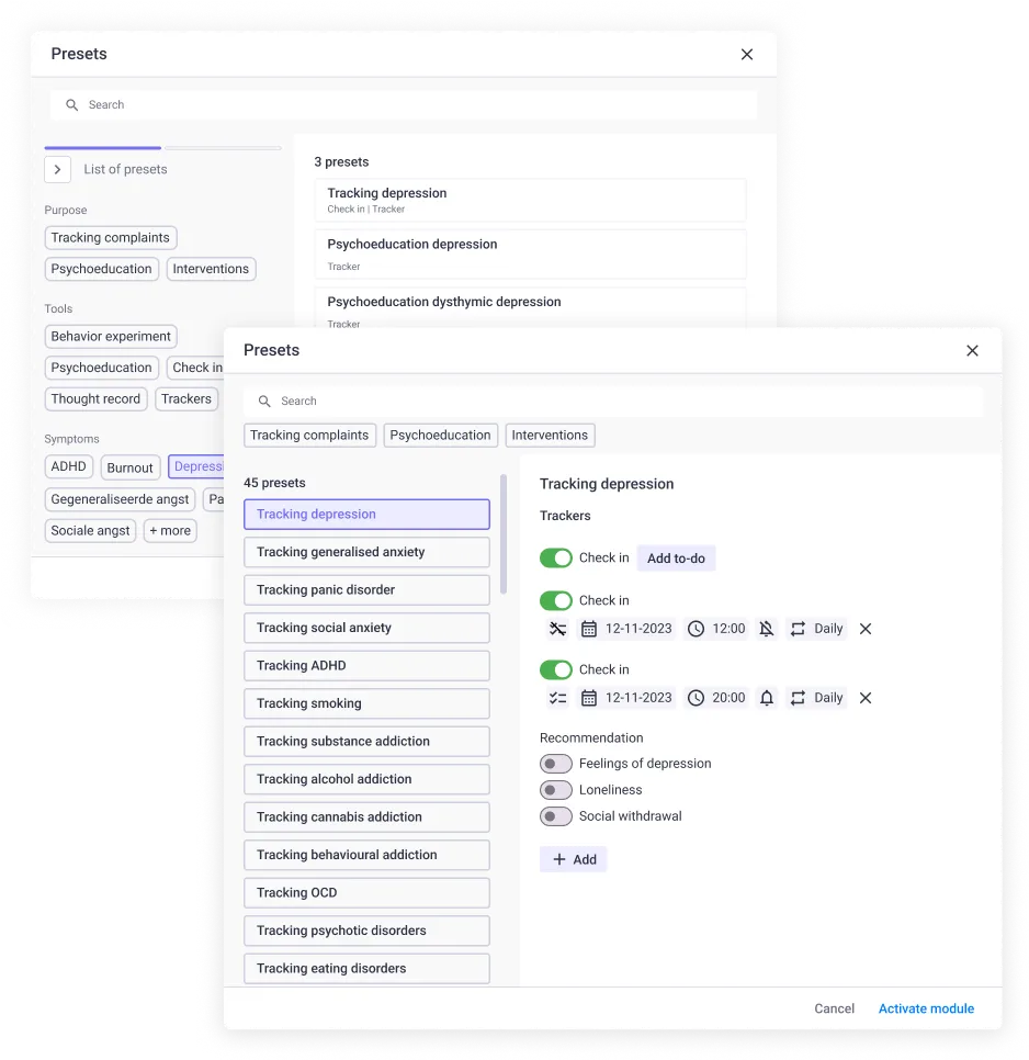
How to display a large amount of presets in a scannable and not-overwhelming way
◆
How to ensure that users understand the content of the presets
◆
If the therapist understands how the client receives the preset in the client app
◆
How flexible should the preset content be
◆
How to ensure that therapists will give feedback in context
Design iteration 1 and A/B testing
Key learnings
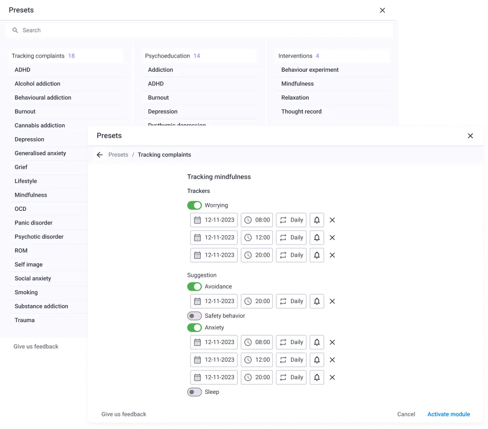
The items in each preset were too much for “one chunk” - 3 or 4 items are ideal.
Categorization that fits therapist workflow: Per intervention, then per complaints. Not per tool.
Better to not categorized by diagnosis (“If there are more, they will be too much”).
Testers were worried about ability to find the diagnosis fast.
About the right side content:
Design A was too much to read
Design B’s edit icon is distracting.
The details are too hidden and “too cryptic.”
They love how easy it is to switch to another preset.
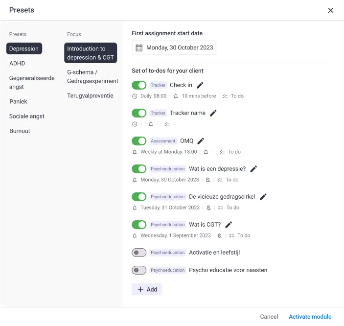
Design A
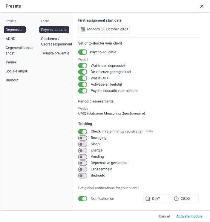
Design B
Design iteration 2
Explored tags and different strategies of grouping, hoping to simplify or remove decision paralysis. We also explored the design direction with a current limitations from our backend.
Tags = cool idea, but needed more content to be effective. Otherwise it is another thing to remember and too much reading.
When listing the categories in front of the complaints name (Tracking, Psychoeducation, Intervention) = Too many repetitive words, creates mental overload for the testers.
The small left side made the choices too cramped and overwhelming.
Design iteration 3
Key learnings
Clear categorization relating to the therapist mental model was the best approach with an included search for easy lookup.
We sacrificed a UI feature that the tester loved because we found in broader testing that the modules are too different from one another and therapists will not heavily use the feature.
-> Will explore in more advanced versions once we know more what the therapists need and use (from data)
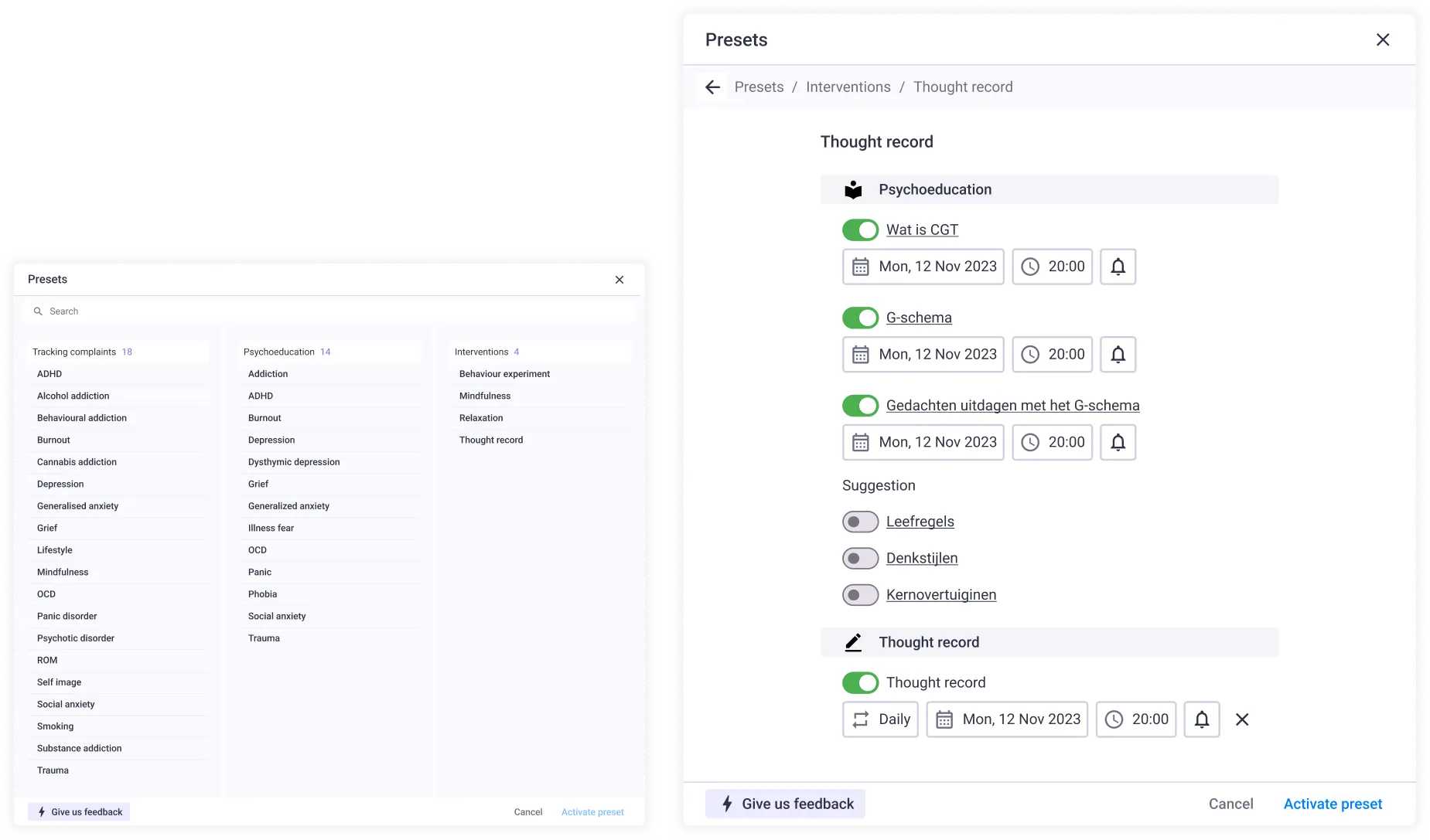
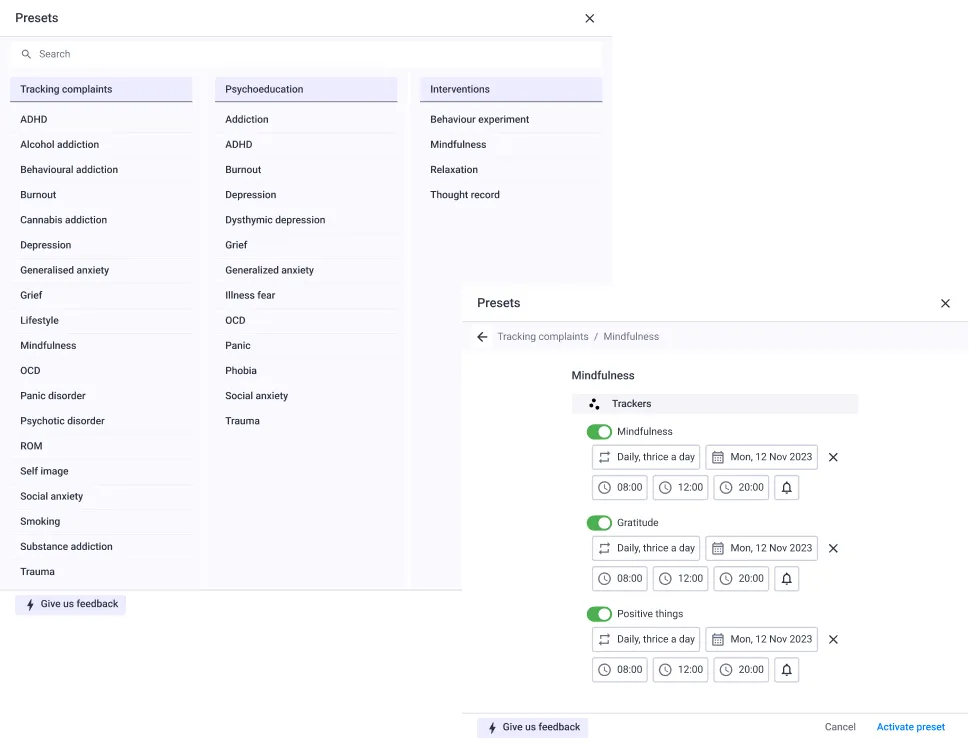
Shipped
Key learnings
Design handover to dev was done when all items were using existing components and all interactions were explained in the design file
Together, the Product Trio solidified the goal for v1: gathering data of what is needed, what is used, and general usage data.
Because of this decision, we descoped some functionalities (such as adding new tasks and seeing previous & next preset mechanic)